
Firefox and Chrome browsers have offered developer tools since they were first released. But as more and more web traffic moves to mobile devices, we thought it was a good time for a refresher on how to use these multi-device testing tools to test the responsiveness of your site before it goes live.
Your New BFFs for Multi-Device Testing
Firefox
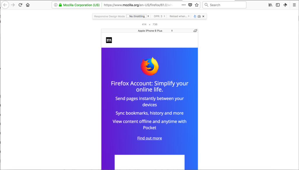
In Firefox, the Responsive Mode tool allows you to either choose from a set of common devices or enter your own dimensions to match your particular device or screen size.
And there are some other nifty perks:
- You can rotate the screen using the tiny icon in the top right corner of the device simulator.
- You can even choose the type of connection your device has—from a slow, regular 2G connection to a fast Wi-Fi connection—which can help you determine load times for your site for your average users.
- Firefox has also added a one-touch screenshot of your view, which you can activate by clicking the little camera icon in the toolbar.
Google Chrome
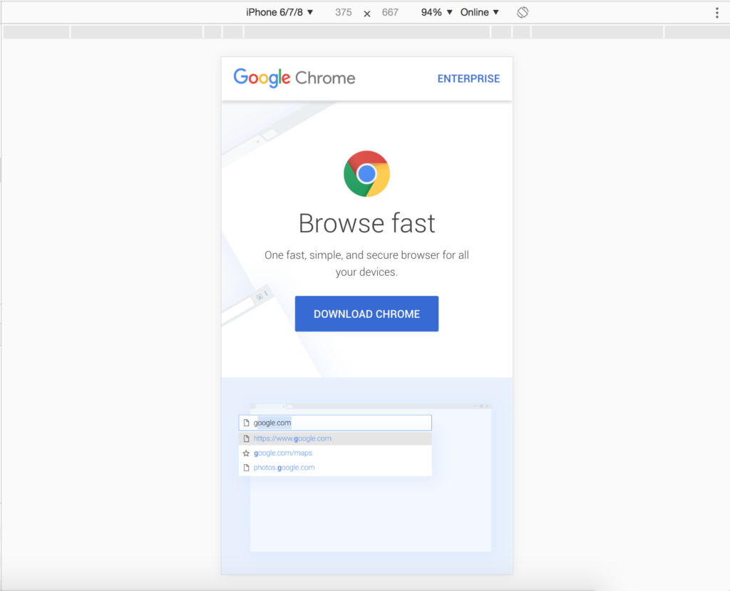
Chrome has a set of similar features in their Device Toolbar, which is part of their developer suite.
- You can select from a set of predetermined devices, customizing for the devices you want to see or entering custom dimensions.
- Rotating the screen is easy with the rotate icon.
- You have fewer connection simulations on Chrome, but you can still take a screenshot of the device by accessing the auxiliary menu (the three dots).
Why We ♥ These Free Simulators
We like these free device simulators for a number of reasons:
- Both simulators offer you a better view of your site on various screens sizes than just resizing the browser window.
- They can also help with troubleshooting unusual site issues seen by users of mobile devices.
- Your actual browser dimensions stay the same, so when switching to other tabs, they remain unchanged.
- The presets for various device dimensions are super duper handy.
- The rotate button to switch between portrait and landscape orientations is snappy and a great timesaver.
While nothing can match the experience of viewing your website on an actual, hand-held mobile device, these free tools can make creating a fully responsive website that works on any device much easier.
Thinking about making your website mobile friendly? Let’s chat and start you down the road to looking fabulous on every device.