CodeGeek blog
-

YouTube Audio and Video Out of Sync – (Window) Size Matters
Read more about YouTube Audio and Video Out of Sync – (Window) Size MattersA common request came from one of our clients the other day: “I want to include some YouTube videos on my website. Can you do that for me?” No problem! We’ll simply get your videos uploaded, find the handy “Embed” code YouTube automatically generates and put it right where you want on your webpages. The…
-

Develop and Test Websites for Multiple Devices Using New Firefox Tools
Read more about Develop and Test Websites for Multiple Devices Using New Firefox ToolsUpdate: Wait, there’s more! As you know, tech changes quickly, so we’ve got more to say on this matter. Check out our post Multi-Device Testing Using Firefox and Chrome to learn more. In a recent Firefox Nightly release, Firefox has added a “Responsive Mode” to their built-in web developer tools. The new Responsive Mode tool creates…
-

Customer Case Studies – JustTrails.com
Read more about Customer Case Studies – JustTrails.comHave you ever tried searching for hiking trails, mountain biking trails, or snow shoeing trails online? We just finished building and launching a brand new website for client Al Walsh that makes it much easier to find trails in the Fort Collins – Laramie – Cheyenne area: JustTrails.com. Al came to us in December describing…
-

Mobile Debugging with Opera Dragonfly
Read more about Mobile Debugging with Opera DragonflyIt’s no secret that mobile websites are the new big thing in web development. And while the number of devices that support a decent mobile browser have been rapidly increasing for some time, the development tools for us to build and test these sites are just emerging. Unfortunately, there’s no way on a mobile device…
-

Time to Go Mobile: Tips for Creating a Mobile Web Strategy (Presentation)
Read more about Time to Go Mobile: Tips for Creating a Mobile Web Strategy (Presentation)Wednesday, May 9, 2012 2:15 pm Location: Keystone Conference Center, Keystone Colorado Part of the LeadingAge 2012 Conference, Ron’s presentation will inform attendees why the mobile web is so important, how to create a mobile web strategy for their business, specific factors to consider, and specific tips for the health care industry, especially as it…
-

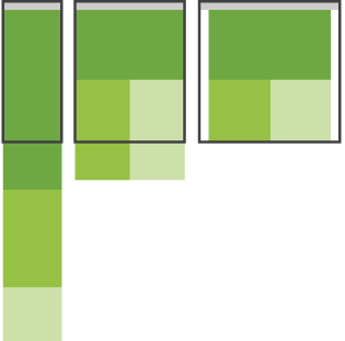
Responsive Web Design – Off Canvas Layout Demo
Read more about Responsive Web Design – Off Canvas Layout DemoIn a recent blog post I mentioned the “Off Canvas” design pattern described by Luke Wroblewski as one of the emerging layout patterns in websites designed using Responsive Web Design. Jason Weaver has created an excellent demo of the “off canvas” technique utilizing three side-by-side panels of content. On the smallest devices like iPhones and…
-
Layout Patterns in Responsive Web Design
Read more about Layout Patterns in Responsive Web DesignAs more web designers and web developers are creating websites using Responsive Web Design techniques, design patterns are starting to emerge. Luke Wroblewski’s article titled “Multi-Device Layout Patterns” catalogs emerging layout patterns. The article is wonderfully helpful in getting one’s head around various approaches to Responsive Websites, especially because it includes not just a description…
-

Responsive Web Design Techniques
Read more about Responsive Web Design TechniquesIn the always awesome 24ways.org (the advent calendar for web geeks) there have been three excellent articles on specific Responsive Web Design techniques so far this month. The first is by Jeremy Keith and discusses conditional loading of content for websites designed using Responsive Web Design techniques. The technique Jeremy describes allows you to have…
-

Adobe Flash to the World: “I’m Not Dead Yet!”
Read more about Adobe Flash to the World: “I’m Not Dead Yet!”Flash isn’t dead. Adobe is continuing development of the Flash Player as well as Flex for desktop web browsers. Adobe’s recent announcement about abandoning development for the Flash Player for mobile web browsers has created a lot of confusion. Unfortunately this confusion will probably push people away from Flash faster than would have happened, or…
-

Dealing with Disappointment
Read more about Dealing with DisappointmentLast week we lost a website development job less than an hour before the kickoff meeting with what would have been our latest new client. I hate losing jobs or projects. As the company owner, one of my most important responsibilities is to bring in new business. This has to happen regularly, consistently, reliably. As…
-

3 Pranks from Google
Read more about 3 Pranks from GoogleI love Google’s pranks on April Fool’s day. Here are three I’m aware of (so far): OMG this is *awesome*. Couldn’t stop laughing: http://gmail.com/motion Ok, Google is topping themselves. Here’s a job listing for “autocompleters”! http://bit.ly/dMDZ3O Another: Go to Google.com, type “helvetica”. You don’t even have to finish typing! Must be those autocompleters they just…
-

Responsive Images: Solving the Image Overhead Problem
Read more about Responsive Images: Solving the Image Overhead ProblemWhen implementing responsive web design techniques, one issue raised by detractors is that the largest image needed for any layout gets downloaded automatically resulting in potentially large bandwidth overhead – an undesirable side effect especially for mobile devices that may be using slower or expensive data connections. Here’s one solution: https://github.com/filamentgroup/Responsive-Images#readme The technique explained and…