Writing good alt text for images involves maintaining a careful balance of detail and brevity.
In fact, if you’ve ever attempted to describe a painting to someone you care about who has lost some (or all) of their eyesight, you’ve come face to face with the importance of this balance.
Attempting to describe an image to someone in real time allows you the chance to understand just how difficult it can be to impart the data and emotion of what is right in front of them—and the incredible reward of getting it just right.
When someone talks about alt text, it’s usually in reference to images on a website (but not always). Because we’re not on the other side of a user’s interaction with our own website in real time, it’s easy to forget that their positive experience can hinge on our ability to provide these extra tidbits of information.
So, how can we make our image alt text the best it can be?
We’re so glad you asked because we have 5 great questions to ask yourself before you hit “publish” on that handcrafted alt text.
But before we get too far into our alt-text how-to discussion, let’s do a quick alt-text refresher on the whats and whys of alt texts for anyone who might be new to the alt-text world.
–> Want to skip straight to the 5 questions we ask to improve image alt text? You got it!
Image Alt Text: A Quick Refresher Course
What Is Image Alt Text?
Alt text is a text label within a website’s code that is used as a substitute for image, multimedia and other non-text content.
Simply put, alt text describes visual content to users who can’t see or access it by conventional means.
Alt text describes visual content to users who can’t see or access it by conventional means.
Who Needs Image Alt Text?
The short answer is: Most of us (at one time or another). Alt text is used by a wider range of internet users than you might expect!
1. Users who are visually impaired
Oftentimes, visually impaired users will utilize a screen reader to freely explore the internet.
Screen readers interpret elements of a website’s code and read the page content out loud.
Alt text defines the description of an image or non-text content that is read aloud by a screen reader, thereby delivering content to non-sighted users that may have otherwise gone unnoticed.
It’s important to note that many people can have a visual impairment, including those who are blind, visually compromised due to aging (cataracts or surgery), or even forgot their reading glasses at home.
2. Users with slow internet
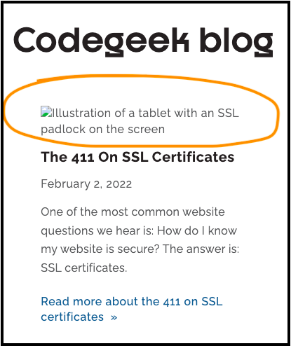
Users with slow or unreliable internet connection also benefit from the proper implementation of alt text.
Images and other media can cause a page to load slower than usual.
So if images are unable to be loaded (or take a while to appear), alt text can be displayed to deliver comparable content to all users.
3. Users who turn off or disable images
There are also users who may, for a variety of reasons, choose to disable image rendering while using the internet.
Whether someone decides to turn off images while online due to visual sensitivity issues, short- or long-term visual disabilities, content restrictions, or any other reason, it’s important to create alternative pathways for accessing site content.
Pro Tip: If you’re a Chrome user and not sure how to turn off images (either for yourself or for testing out those alt texts), here’s a handy how-to with step-by-step instructions for disabling images in Chrome.
Why Add Image Alt Text?
The short (and best) answer is: Adding image alt text helps make the internet better—more accessible—for everyone.
Including alt text with images is a part of “web accessibility,” which is the global effort to make sure that people with all kinds of disabilities can use the Web.
In our industry (and web-based content at large), there are many standards for web accessibility, but the most common benchmark for evaluating websites is the Web Content Accessibility Guidelines (WCAG).
Not only is making your website as accessible as possible the right thing to do because it improves the web experience for all, but it also helps protect your business.
Learn more about all the reasons why an accessible website is a better website—and how CodeGeek can help you get there.
Adding image alt text helps make the internet better—more accessible—for everyone.
How Do Users Interact With Image Alt Text?
Striking the right balance with image alt text is important so that it’s not too long, not too short, and eventually is just right.
On the one hand, it’s tempting to fill alt text to the brim with vivid detail to ensure that your users have a crystal clear image of what you’re describing.
On the other hand, it’s also tempting to be as lean as possible with your alt text to help your user move more efficiently through your content.
By adding copious amounts of detail to your alt text, you could be:
- Creating redundancies in your content
- Giving away important information that the user is not yet ready for contextually
- Boring your user by forcing them to listen to an unnecessarily long description of a relatively mundane part of the content (especially if your image is purely decorative)
By trimming away too much detail from your alt text, however, users could:
- Miss out on important contextual information for understanding the proceeding content
- Lack the emotional or narrative power of the imagery on your page
- Be confused by the interruption if new information was not added
To better understand how users may interact with image content using a screen reader, check out this brief screen reader demo clip from the University of California San Francisco.
The whole video is worth a watch, but the specific linked clip shows what it’s like when alt text is written well—and when it’s written poorly.
Notice the structure of the information provided by the screen reader when alt text is properly implemented:
- The screen reader reads the image alt text.
- The screen reader also notifies the user that the previous information was associated with an image.
Ensuring that your alt text is well written helps the flow of content remain consistent across all web-based experiences for those that use assistive technology to browse the web.
Pro Tip: See question #3 below that talks about how being mindful of character limits can help with this.
How Do I Get Started With Writing Alt Text?
Writing alt text is all about providing a short description of the image you’re looking at … to someone who can’t see it.
This can be a little difficult without a common frame of reference. And we have (what we think is) a great analogy to put you in the right alt-text state of mind.
Pretend you’re describing the image to a friend on the phone.
Based on your description, would your friend be able to:
- “See” what you see?
- Understand why this image is important?
If your answer is “yes!” after you’ve written your alt text, then you’re off to a great start!
To get started writing great alt text, pretend you’re describing an image to a friend on the phone.
How To Improve Alt Text: 5 Questions To Ask
Crafting image alt text can be an art, especially if you want to marry alt text best practices with a strong command (and poetry) of the written word.
And finding that balance between detail and brevity can be challenging.
Asking yourself these 5 questions and editing your alt text accordingly will result in clearer content that is more accessible to a wider audience.
1. What is being said in the content directly before and after the image that I am writing alt text for?
When it comes to alt text, it’s all about context.
Asking this question will allow you to know whether or not your alt text is providing redundant information that should be trimmed away.
This question can also help you know if more information is needed to bridge the gap between the previous and the following content on your page. Win-win.
When it comes to alt text, it’s all about context.
2. How does this image reinforce the message of my online content?
Images are often added to websites to evoke a certain feeling or to help tell a specific story.
By asking this question, you will be able to understand whether or not the alt text you are writing is reinforcing your message with users who can’t see the image—or if your image is just taking up space.
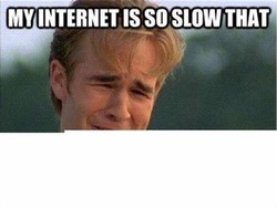
For example, when deciding on an image to use to communicate unreliable internet connections (a reason why users may have images turned off), we were choosing between the Dawson meme or a more standard no-internet icon.
Which one would you choose?

We went with Dawson because we decided his tortured expression (and the incomplete graphic) reinforced the frustration felt when images don’t load on a web page.
And this image (and its related alt text) enhanced the story we wanted to tell with this post.
We’re not saying that one image or its alt text is more correct than the other for all occasions.
Your choice depends greatly on context (see question #1 above), your audience, and whether or not your image complements the rest of your content.
3. How many characters have I used to write this alt text?
A good rule of thumb is to try to keep your alt text at about 125 characters in length.
The main reason for this (other than our limited attention spans) is that many assistive technologies process text in 125-character chunks.
So that means crafting alt text requires a fine balance between detail and brevity.
Think of it as a Goldilocks-type equation:
– Alt text with significantly fewer than 125 characters = may be too short.
– Alt text with significantly more than 125 characters = may be indulging in too much detail.
+ Aiming for 125 characters is = just right.
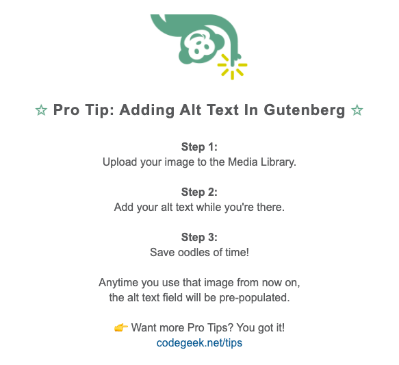
Pro Tip: An important caveat to the 125-character rule is for images that are mostly text (such as the Pro Tip near the end of this post). Text images should usually contain the full text in the alt text, even if it goes beyond 125 characters.
4. Am I describing detail that either isn’t actually seen in the image or is repeated elsewhere?
Adding too much context to the image you’re describing can lead to leeeeengthy alt text, and that extra detail most likely isn’t adding the value you think it would.
If you step back, you’ll probably find that the additional context is provided elsewhere in the content of the page, so there’s no need to add it to your alt text.
Remember: Your alt text is meant to enhance your page content, not repeat it.
Your alt text is meant to enhance your page content, not repeat it.
5. Is my alt text explaining the purpose of, well, alt text?
Yeah, that question might sound like a looping argument, but hear us out.
One common (but easy-to-fix) problem we see with alt texts is that authors use it to explain why they put the alt text there in their first place.
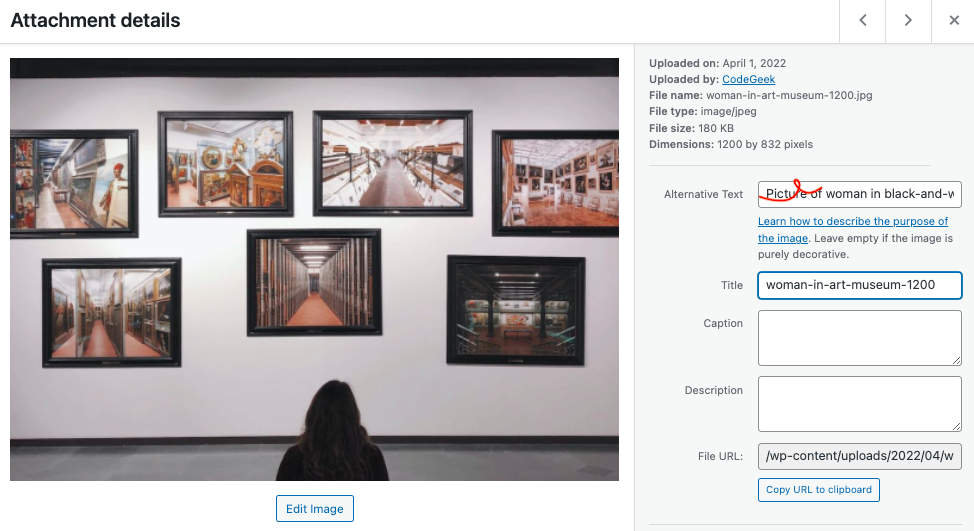
For example, the alt text will start with phrases like “Picture of” or “Image of” — and that’s 100% not needed.

While the motivation for adding these explanatory details is admirable, assistive technologies make it clear to users when focus is being given to an image (and that an image is being described).
Adding these additional phrases simply adds length to your alt text without adding substance.
Extra Credit: For Image Alt Text Aficionados
Those are our 5 favorite questions to ask when crafting image alt text, but there’s always more to learn!
With that in mind, we have a few extras for those who want to take their alt text-ing to the next level.
Pro Tip for Users of WordPress’ Gutenberg Block Editor
Do you use WordPress’ new-ish block editor Gutenberg? Then this image alt text tip is for you!
If you plan to use an image in multiple places with the same alt text:
- Upload the image to the Media Library first and add your alt text there.
- Doing this will pre-populate the alt text field when you add the image to your Page or Post, and it will save you from having to enter the same alt text multiple times.
If you only need to use the image in a single place:
- Simply upload it where you need it (Post, Page or Featured image) and add your alt text there.
- This does not make that alt text show up with the image in the Media Library, but you don’t really need it to since you’re not adding the image in other places.
Additional Reading About Image Alt Text
Image alt text isn’t only for websites! We interact with digital images on social media, in newsletters and so much more.
Here are a few extra resources with practical tips for helping you add image alt text in all the places.
- WordPress CMS
- How To Add The Alternative Text Attribute To WordPress Images In Under 1 Minute, by Martin Petrov for MorningScore
- Social Media
- Social Media Accessibility: A Guide To Alt Text On Social Media, by Sangita Iyer for Tug
- Alt Text Hall Of Fame, a project by Stefan Bohacek
- Mailchimp
- Add Alt Text to Images, Mailchimp Help Center
Need some help from the Geeks?
We know there’s a lot to consider when crafting the best image alt text—and web accessibility in general.
If you’d like to talk with us about how to improve your site accessibility-wise (and learn more about our web accessibility services), we’d love to chat!


