Make sure to look at your site
on mobile devices.
- Your site may look great on desktop, but nowadays you must assume that people will visit your site via their smartphones or tablets. If they have a bad experience on those devices or even in different browsers than the one you normally use, that could mean loss of sales and new business.
- Even if you work in the B2B industry, people will view your site on their smartphones or tablets. In fact, 42% of B2B researchers use mobile devices during the product purchasing process.
- For a site to work well on mobile, it’s not enough to make everything smaller. You don’t want to make your visitors squint to see important information or not be able to click on a Buy button because it’s too small.
- People checking out your site on mobile devices have less patience for slow site speeds. They may be on the go or visiting the site using their phone’s data plan. Faster page loading speeds lead to fewer bounces off the page by visitors.
Talk with your users.
- When you talk with users, you will start to see things from their perspective. It's important to recognize that you’re biased because this is your baby, but your users have lots of choices. Your website is one of many they may visit in a day. If it’s not obvious how they can do what they are looking to do, they will move on.
- There was a research study where they found motivated buyers and gave them money, but they only purchased 30% of the time. Why? “On most of the sites, users just couldn’t find what they were looking for and the site’s organization was to blame.”
- When customers have a great user experience on your website, they’re more likely to come back. “79% of shoppers who are dissatisfied with site performance say they're less likely to purchase from the same site again.”
- In talking with your users, you will learn what customers really want and be able to develop products and services that they want and need.
Don’t make your logo bigger.
- Making the logo bigger misuses important website real estate. Having a huge logo crowds out elements of the page that your visitors might find more helpful, like the navigation menu or the call to action.
- A bigger logo doesn’t guarantee that people will remember your brand. People remember brands that help them do what they came to the site to do and treat them well.
- Great logos work at any size. If you’re worried your logo won’t work at a small size, that indicates that your logo might be too detailed. A professional designer can take a look at your logo and recommend improvements.
Limit the number of items and choices in your menus and on your homepage.
- More choices lead to more exhaustion for visitors. When faced with a multitude of choices, visitors end up feeling unsure about where to start or that they missed something important in a previous page. This causes mental strain and makes it harder for them to make decisions.
- Consider that small changes may impact users' decision time positively or negatively. The change you make may require users to consider one more thing. Or it could make them feel that they might risk making the wrong choice and having to find their way back to the start to make a better choice.
Alternatively, making small, incremental changes that positively impact the user's experience can make a huge difference. For example, if you have a button to inspire visitors to take action but it isn't getting the number of clicks you'd like, you could try changing the button color to a more vivid color. A small change like that can make a big impact to conversions. - The more complicated your site is, the higher chance that your user will bow out and go to your competitor. (source)
When it comes to website changes, earlier is cheaper.
Much cheaper.
A common saying is that website changes cost $1 in the design phase (at the beginning), $10 in the development phase, and $100 after launch. Dealing with problems later on in the process also can delay the project launch date.
IBM research shows an even higher cost for changes: “The costs of discovering defects after release are significant: up to 30 times more than if you catch them in the design and architectural phase.”

Don’t let your images slow down your site.
To explain further, here is an excerpt from our blog post on image optimization:
"Large images need to be completely loaded before the whole webpage will be visible to the user. This process can happen in a blink of an eye or last for several painful minutes (if your visitors even wait that long).
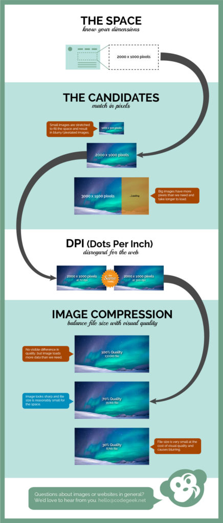
When we talk about page load speeds, seconds count! According to this study, visitors will wait 5 seconds or less for a site to load on their mobile devices—and it’s even fewer for desktop users. If your images slow down your site’s loading speed, you could lose customers. To optimize your images, you want to display them at the correct dimensions (height and width) at the best quality they can be (high resolution) while keeping the file size as small as possible."
The graphic below shows all the components of an image, explaining how space, dimensions, and image compression options work with images or graphics. The first step of image optimization, which is making sure your images don’t slow down your site, is to confirm that you're using the correct image file type. The second step relates to image compression, you can learn more about image compression here.
Update your site's copyright year ... every year.
Updating your website’s copyright year can go a long way to helping your site feel current. (And you usually only get one chance to make a first impression!)
Depending on your site’s theme, making this kind of update can be DIY fun or something better left to the experts.

If you need help updating your site’s footer (where most copyright year’s live), we’d love to help!
How to add image alt text in Gutenberg
Do you use WordPress’ new-ish block editor Gutenberg? Then this image alt text tip is for you!
If you plan to use an image in multiple places with the same alt text:
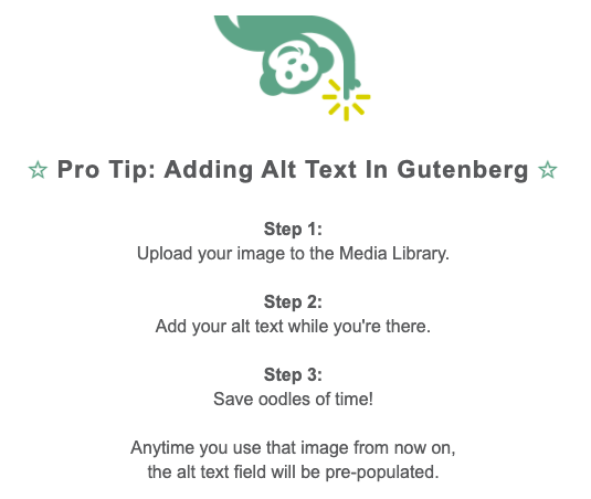
- Upload the image to the Media Library first and add your alt text there.
- Doing this will pre-populate the alt text field when you add the image to your Page or Post, and it will save you from having to enter the same alt text multiple times.
If you only need to use the image in a single place:
- Simply upload it where you need it (Post, Page or Featured image) and add your alt text there.
- This does not make that alt text show up with the image in the Media Library, but you don’t really need it to since you’re not adding the image in other places.
➡️ Want to learn more about how to improve your image alt text? Check out our post: How To Improve Image Alt Text: 5 Questions To Ask
How To Allow Guests To Modify
Google Calendar Events
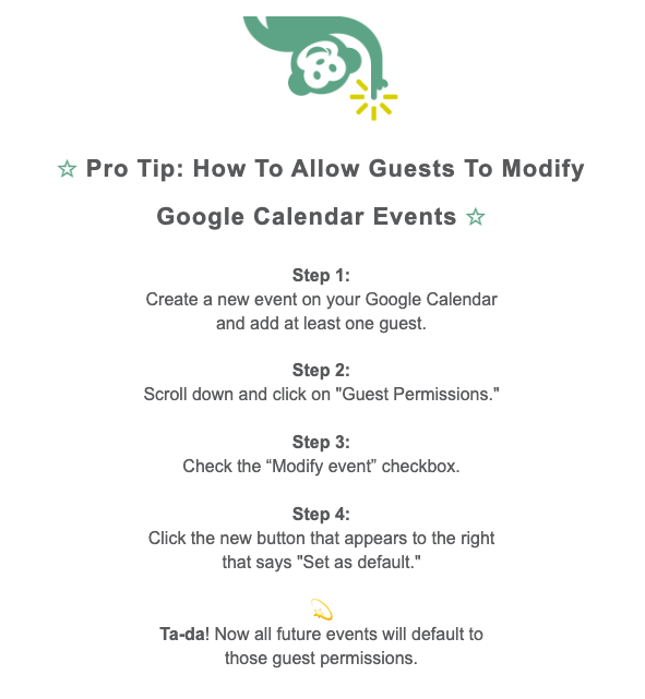
If you're like the Geeks, then you know how handy it is to allow teammates to modify calendar events so that a single person isn't chained to their calendar.
How to allow others to modify our Gcal event details eluded us for a long time, but no longer!
Check out the tip below to learn how to make this Gcal update once—and then enjoy the benefits forever (well, until you change the default settings, that is).
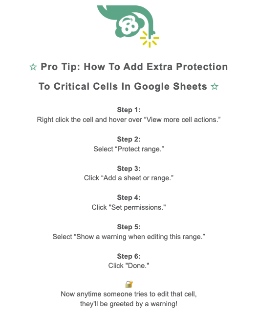
How To Add Extra Protection To Critical Cells In Google Sheets
Have you ever been working on a spreadsheet and wished you could broadcast to everyone else who has access just how important certain cells are—and to use extra special care when editing those cells?
If you use GSheets in Google Workspace, you can!
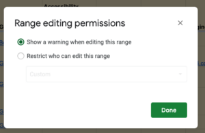
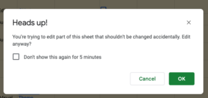
Check out the tip below to learn how to add extra protection to these critical cells—in six easy steps.
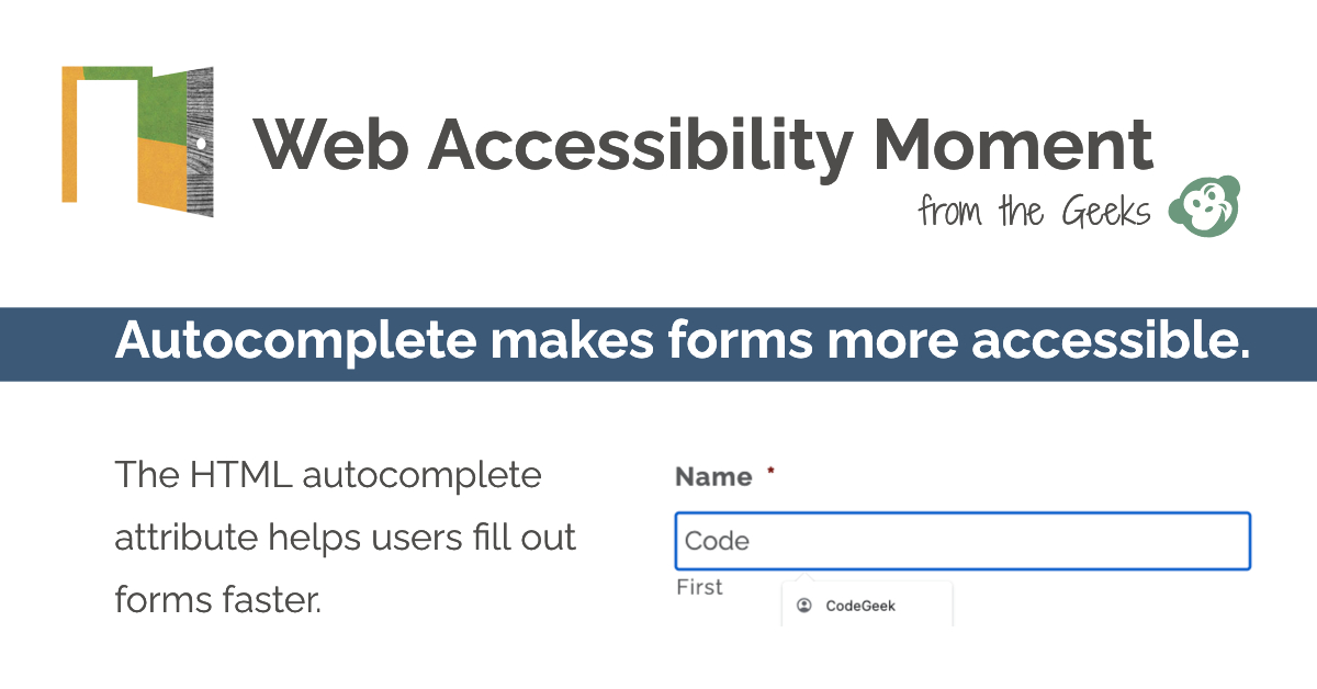
Autocomplete makes forms more accessible.
How can you make your online forms more accessible?
In a word: Autocomplete.
The HTML autocomplete attribute can be added to form fields so that:
✅ browsers and assistive technologies get the gist of what the form wants, ...
✅ and then offer up options based on a user's own personal info.
"Automatically filling personal information into a form with just one or two clicks is more than just a convenience; it’s an accessibility feature too. One that is made possible by the HTML autocomplete attribute." — Amber Hinds, Equalize Digital
Best practices for HTML headings
What are the best practices for creating HTML headings?
We're so glad you asked!
Follow these three best practices for for making sure your HTML headings are as accessible as possible:
- Use one unique h1 per page to describe what the page is about.
- Heading levels should be hierarchical, similar to a book index.
- Choose a heading level based on context—not appearance.
"Headings are the backbone of the content of a page. A visitor should be able to scan the webpage using headings to get a good impression of its content." — Rian Rietveld, The A11Y Project
Make it easier to find help and support.
How can you make it easier for site visitors to find the help and support they need?
Simply put: Put help in the same place when it's on multiple web pages.
What does help look like?
– Human contact details (phone number, email address, hours of operation)
– Human contact mechanism (messaging system, chat client, contact form, social media channel)
– Self-help option (FAQs, How Do I? and Support pages)
– Fully automated contact mechanism (chatbot)
► Learn more about this WCAG 2.2 (Level A) requirement, courtesy of W3C.
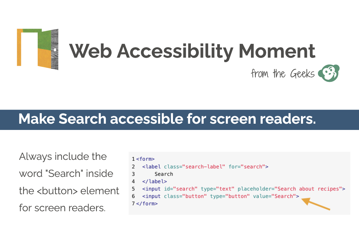
Make Search accessible for screen readers.
If you have a search feature on your website, be sure to make it accessible for those using screen reader devices.
How do you do this?
–> Always include the word "search" inside the element for screen readers.
–> To learn more about how to make search components accessible, check out a11ymatters' article Exploring How To Build An: Accessible Search Form.

