
Responsive Web Design
What is responsive web design?
Your website should work beautifully wherever, and however, visitors use it.
Responsive Web Design (RWD) changed the world back in 2010, and it creates one flexible website that adapts to different screens and devices—from phones and tablets to laptops and large desktop displays.
Good responsive design, however, is about more than making everything fit. Your site should remain easy to read, navigate, and use at every size.
How is responsive design built into the web development process?
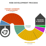
At CodeGeek, responsive design is built into our process from day one.
We consider how content, navigation, images, forms, and interactive elements should adapt throughout the entire web development process.
We also think beyond screen size. We consider how the site works when someone:
- zooms in
- enlarges text
- changes device orientation
- uses a touchscreen
- navigates with a keyboard
Every website we create is responsive by default. No separate mobile site. No responsive-design add-on. Just one thoughtfully designed, accessible website built to adapt.
Responsive design and accessibility go hand in hand—and we build with both in mind.
Does my website need to be responsive?
In short: yes. That’s because responsive design isn’t a nice-to-have anymore. It’s simply part of building the web well.
To show you what responsive design looks like in practice, what our short video below demonstrating the benefits of a responsive site we developed.
Watch our Responsive Web Design demo
Let’s talk
—> Contact us to discuss how we can create your custom website.