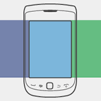 In a recent blog post I mentioned the “Off Canvas” design pattern described by Luke Wroblewski as one of the emerging layout patterns in websites designed using Responsive Web Design. Jason Weaver has created an excellent demo of the “off canvas” technique utilizing three side-by-side panels of content. On the smallest devices like iPhones and smart phones two of the three panels are “off canvas” and clicking on a navigation element slides the additional content into view. On devices that have larger screens more of the content is shown by default with only one of the three content panels hidden off-screen when viewed with an iPad in portrait orientation for example, and all three content areas are displayed within the viewport at screen resolutions of 1024 x 768 or higher (e.g. iPad in landscape orientation).
I find this a really interesting Responsive Web Design technique and Jason’s article explains the code (CSS3 and Javascript) he used to create the demo. It’s a great case study and demonstration of the technique:
Original article A Multi-Device Web Layout Pattern